Today's tutorial is a page I did 2 days ago.
I wanted to experiment with gradients of colour and contrasts of shapes.
I struck a few challenges in this piece. It is so wonderful to be able to add extra layers to a page to change the direction of a page and to make it work.

The finished page: Circles

I am using a seed report for my sketchbook at the moment. I thought it went with the theme unfurled very well. For the first layer I stamped the page with blue circles (a large piece of cork) and a flower commercial stamp. The circles were with a bright blue and the flowers a teal green.

On the second layer I spread 2 slightly paler blues on with a toothbrush. This made the layer a little thinner and more of the bottom layer cam through.

Then I added a layer of paler blue again with a toothbrush. The scratchy look was very effective.

In the next layer I added a repeated motif of a house stamp I carved from an eraser. I chose a complimentary colour scheme because I wanted the houses to pop. I was hoping that I would still see the underneath stamps but I couldn't. I really didn't like the direction this page was going in. So.......

In the next layer I decided to add more thin blue paint over the stamps. I then ran my finger through the paint to add more texture.
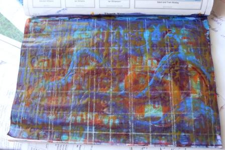
I drew over the page with silver lines and a orange wash. I now had a background I was happy to work on.

I used a homemade stencil to put a grid over the background. I Started with a red brown and added a little white and ochre brown into the paint as I moved across the page. When I got to the middle I added a lot more ochre and white and continued until I had a very pale brown.

I printed on circles with a large cork. Going opposite with the colours this time. I wanted the circles to float on the page.
To finish this page I used a gold and silver pen (Gold on the right cirlces and silver on the left) to add detail on the large circles and small cirlces to add more interest to the page.

Beautiful finish but wow...who woulda thunk it?!?
ReplyDeleteWonderful page, and wonderful results. I LOVE layering, it takes you places. xx
ReplyDelete